Saturday, July 9, 2011

In Tribute to the Yellow Warriors

 
"Bersih seems more successful in uniting Malaysians from all walks of life in 3 weeks than 1Msia tried to do in the last 3 years."

Tuesday, July 5, 2011

Help me...win!

Everyone, I need your favours. I entered this logo design competition organised by the government. I was required to design a logo for our county's up and coming MRT project. Grand prize is RM10,000! I need all of you to like my entry.
It's one of the only green ones, underneath says posted by KIN MUN.
I also posted a red and blue version...like them too!
To vote, you have to log in, but this only takes less than a minute! CLICK HERE!


LOGO RATIONALE
This logo for the 'My Rapid Transit'  applies the ease and friendly nature of their vision and priorities within the Transport sector. The colors used are a soft blue and a darker blue. The soft blue demonstrates a friendly, well balanced and caring company, while the darker blue reveals the more stable and functional priority of the company’s vision. Below the initials of the company - which stress the name of the company for ease of remembering for the audience - are two arrow looking shapes pointing in opposite directions which represent the MRT commuters moving rapidly.
A slanted and bold 'Avantgarde' font is applied for the initials of the company, giving it a sense of vision. The graphics used are kept as minimal as possible so that the logo is pleasing to the eye and not too aggressive.

Saturday, July 2, 2011

Messing Around with Photoshop-colour selection

Making Dark Images Look Better
For people who do not own SLRs like myself, Photoshop can help improve image quality significantly. For underexposed shots like the one below,  use shadow/highlights or levels to brighten up the image. Then increase the vibrancy to make the image look 'prettier'. Images like these are very noisy. Use the smart blur tool to minimize this noise. Careful not blur the image too much as this will reduce the detail of the image.
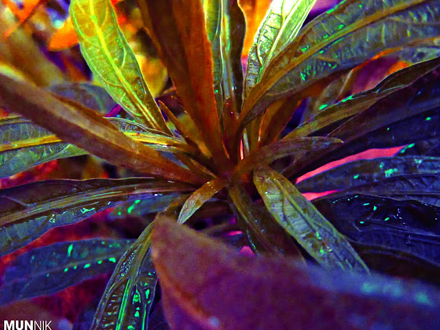

More About Colours
By tweaking the the colours of this plant using the selective colour option  under adjustments we can give a surreal Avatar-ish effect to a normal looking plant. Also try to adjust the levels of the image...see what turns out best for you. Happy trying!

Important note: There is no right or wrong in Photoshop...as long as the final product turns out great, then you good to go!